Room Booking Overview
At OfficeSpace Software, I led the design of a new feature called Room Booking Overview, which gave Facility Managers an all-new way to track their room bookings, optimize space capacity, and even move meetings with one click to accommodate their needs—all in an intuitive calendar interface.

The Problem
Without a one-stop calendar view that integrated data from OfficeSpace, Facility Managers had no way of identifying booking inefficiencies.
By including some key clients early on in the design process, we ensured that the final product was perfectly suited to the needs of the target user persona.
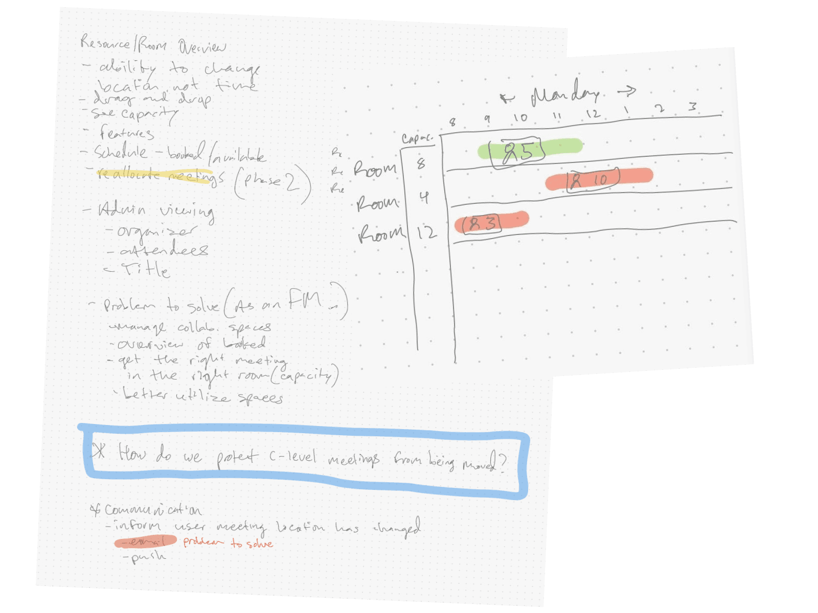
Starting with a Sketch
Because we had a decent idea of what the solution would look like, it was tempting to move quickly to final designs. But rather than getting ahead of ourselves, we started with a pencil and paper, listing wthe core requirements and sketching out a rough idea of the interface.
Vetting the Idea
In a series of one-on-one research calls with clients who had specifically requested this feature, I showed a wireframe prototype of the idea. This stage was crucial, as the feedback we gathered helped us triangulate 1) what unique value proposition we could offer, 2) what would be useful to our users, and 3) what existing solutions the feature would be competing with.
In the end, these interviews helped us ruthlessly prioritize which aspects were required for MVP and which could be added in subsequent phases.
Key takeaways from preliminary research
- Even a basic, no-frills version of the feature would be useful to our users as a starting point. Features like reporting and coloring by capacity could be added later.
- Moving meetings through drag-and-drop was found to be extremely intuitive, and would be our first priority after launching MVP.
- Meeting privacy settings would need to be taken into consideration. Even seeing the title or the participants might be too sensitive.
Taking it to High Fidelity
Armed with knowledge and a finalized MVP scope, I now felt comfortable creating high-fidelity designs. Some aspects could utilize existing components from our design system, but there were some interactions, such as the grid layout and timeline scrubber, that were unique to this page. For these new patterns, I borrowed from similar experiences in other products like project management software and even video editing tools.

Preparing for a Smooth Handoff
My core deliverable was a few dozen static screen mockups, but I know better than to think that will be enough for an efficient engineering handoff. My final Figma file also contained written documentation of our design decisions, links to videos I’d made for certain interactions, and specs for responsiveness, loading states, and screen transitions. All that meant that the build process was done in less than a quarter, with a minimal amount of back-and-forth and QA tickets.
Outcomes
"Ding ding ding!"
The exact reaction of one of our clients upon seeing the alpha version of this feature for the first time.
We expected this feature to find a dedicated niche in our client base, and it did. Room Booking Overview was launched as an add-on purchase with an attach rate of 25%, exceeding our expectations and immediately driving revenue growth. Since launch, we’ve shipped additional follow-up improvements based on our initial user research, creating a small but ardent set of users whose return rate signals just how well we hit the mark.
