Building a CRT display with linear-gradient and mix-blend-mode
This was fun to puzzle out. How can you create a working RGB pixel display using only CSS and minimal HTML?
There are several sensible ways to do this, but wanting to make it a challenge, I gave myself some constraints:
- Clean HTML – one single div for the entire screen, not a div for each pixel or even a div for each column of pixels. I eventually gave myself permission to use two pseudo elements.
- Rather than a perfect grid of pixels, I wanted to mimic the CRT-style pixel geometry of offset columns. (I know CRTs don’t use pixels, per se.) This took the longest time to figure out.
- No Javascript for the color screening, just CSS blend modes.
The theory I was testing here was that by putting, say, a red element over a set of RGB “pixels,” and using CSS blend modes, I could simulate how RGB-based subpixel rendering works in real life. And it worked!
Here’s how the HTML is structured:
<div class="pixels">
  <div class="background">
    <div class="circles">
      <div class="circle circle-red"></div>
      <div class="circle circle-green"></div>
      <div class="circle circle-blue"></div>
    </div>
  </div>
</div>
The background here, as you’ll see in the CSS below, essentially turns the screen off so that the image on top of the background, the circles, can illuminate only the pixels beneath them. Hard to explain, but it works.
Now the challenging part: The subpixels. In order to make the offset grid work, every pixel is actually two pixels side by side. Each is built with two overlaid linear gradients, one for the RGBRGB, and one for the black lines between each pixel and subpixel. These could technically have been one single gradient, but that would have been an absolute monstrosity. As it is, it’s not pretty:
.pixels {
  background:
    linear-gradient(
      90deg,
      rgba(0, 0, 0, 1) 0%,
      rgba(0, 0, 0, 1) 3.125%,
      rgba(0, 0, 0, 0) 3.125%,
      rgba(0, 0, 0, 0) 15.625%,
      rgba(0, 0, 0, 1) 15.625%,
      rgba(0, 0, 0, 1) 18.75%,
      rgba(0, 0, 0, 0) 18.75%,
      rgba(0, 0, 0, 0) 31.25%,
      rgba(0, 0, 0, 1) 31.25%,
      rgba(0, 0, 0, 1) 34.375%,
      rgba(0, 0, 0, 0) 34.375%,
      rgba(0, 0, 0, 0) 46.875%,
      rgba(0, 0, 0, 1) 46.875%,
      rgba(0, 0, 0, 1) 50%,
      rgba(0, 0, 0, 1) 50%,
      rgba(0, 0, 0, 1) 53.125%,
      rgba(0, 0, 0, 0) 53.125%,
      rgba(0, 0, 0, 0) 65.625%,
      rgba(0, 0, 0, 1) 65.625%,
      rgba(0, 0, 0, 1) 68.75%,
      rgba(0, 0, 0, 0) 68.75%,
      rgba(0, 0, 0, 0) 81.25%,
      rgba(0, 0, 0, 1) 81.25%,
      rgba(0, 0, 0, 1) 84.375%,
      rgba(0, 0, 0, 0) 84.375%,
      rgba(0, 0, 0, 0) 96.875%,
      rgba(0, 0, 0, 1) 96.875%,
      rgba(0, 0, 0, 1) 100%
    ),
    linear-gradient(
      90deg,
      var(--red) 0%,
      var(--red) 16.5%,
      var(--green) 16.5%,
      var(--green) 33%,
      var(--blue) 33%,
      var(--blue) 50%,
      var(--red) 50%,
      var(--red) 66.5%,
      var(--green) 66.5%,
      var(--green) 83%,
      var(--blue) 83%,
      var(--blue) 100%
    );
}
With that done, I had to create the vertical borders between each pixel. I have a feeling it’s possible to create these using one wickedly complicated mask on the same element above, but eventually gave up on this approach and switched to two pseudo elements. Each uses a two-part mask with compositing to stop the horizontal line from stretching across the full width of the double-pixel gradient. (There’s no way anyone is following this, right?)
.pixels::before {
  background-color: black;
    mask-image:
      linear-gradient(
        180deg,
        rgba(0, 0, 0, 0) 0%,
        rgba(0, 0, 0, 0) 87.5%,
        rgba(0, 0, 0, 1) 87.5%,
        rgba(0, 0, 0, 1) 100%
      ),
      linear-gradient(
        90deg,
        rgba(0, 0, 0, 0) 0%,
        rgba(0, 0, 0, 0) 50%,
        rgba(0, 0, 0, 1) 50%,
        rgba(0, 0, 0, 1) 100%
      );
    mask-size:
      var(--pixelSize) calc(var(--pixelSize) / 2),
      var(--pixelSize) var(--pixelSize);
    mask-repeat: repeat, repeat;
    mask-composite: subtract;
}
Lastly, what turned out to be the easy part: Create elements on top of the pixels send to mix-blend-mode: screen . Using the example of a red circle, this causes the subpixels to behave how they would in real life:
- Red subpixel is illuminated
- Green subpixel is multiplied to black
- Blue subpixel is multiplied to black
…except, it’s not quite perfect given that most modern displays render in something other than sRGB. So on my Apple screen, I get this instead:
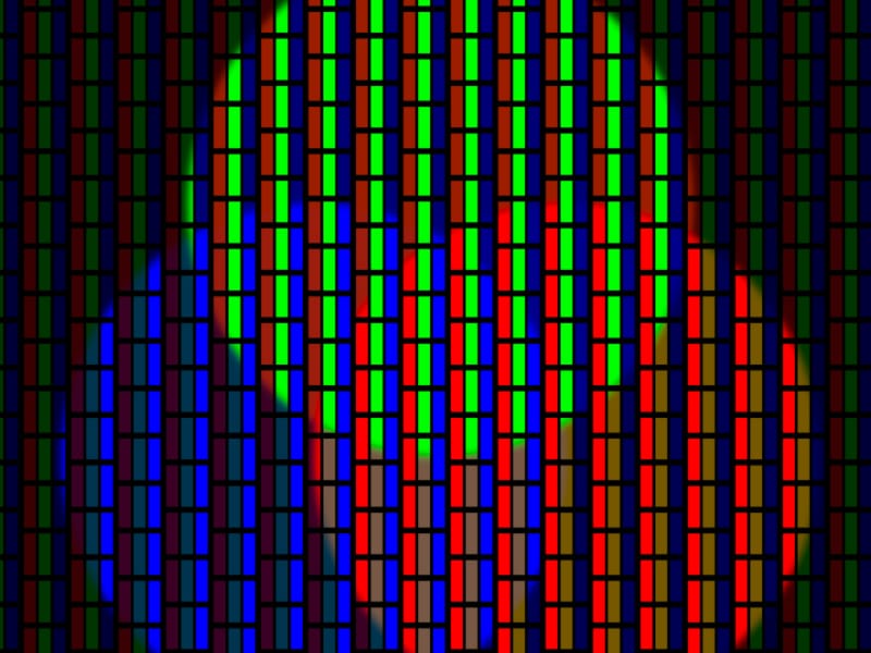
But do we care? Hell no! Because when lowering the pixel size variable to something small like 4px, the final effect really sells it. By overlapping red, green, and blue elements all set to screen, a white center piece appears even though there is not a single white element on the screen. Fun!

